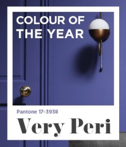
Pantone 17-3938
With the last 18 months being shadowed firmly by the global pandemic you’d be forgiven for thinking that Pantone’s 2022 “colour of the year” would be a big serving of grey. Thankfully that isn’t the case.
Each year Pantone, leaders in forecasting global colour trends, announces a new Colour of the Year that they predict will be the next BIG thing. This year the colour unveiled is ‘Very Peri’ (also known as the very uninspiring Pantone 17-3938). A very strong colour that “embodies a courageous presence and encourages personal inventiveness and creativity” and if you think you’ve already seen a lot of this then you’re not mistaken as it’s been a feature on the a-list shoulders, red carpets and magazine spreads for the past few months.
When choosing a colour of the year for 2022, the Pantone Colour Institute did something it has never done before – it created an entirely brand new colour rather than selecting from its already vast array of hues. So before you say ‘that’s a nice shade of purple’ think again! To make sure you don’t get kicked out of polite society this year just know that this is actually “a vibrant shade of periwinkle blue with undertones of energizing red and violet”. You have been told.
“Very Peri helps us to embrace this altered landscape of possibilities, opening us up to a new vision as we rewrite our lives,” Pantone wrote on Instagram.
“The Pantone Colour of the Year reflects what is taking place in our global culture, expressing what people are looking for that colour can hope to answer,” Laurie Pressman, Vice President of the Pantone Colour Institute, indicated.
It also reflects the global innovation and transformation that is currently gripping our society.
“As society continues to recognise colour as a critical form of communication, and a way to express and affect ideas and emotions and engage and connect, the complexity of this new red-violet infused blue hue highlights the expansive possibilities that lay before us,” Laurie says.
Now, a lot of people may be shaking their heads that there is a full-time job/team/company dedicated to selecting this one hue each year but it does have ramifications and influence in a lot of day-to-day moments. You’ll see Very Peri sneaking onto fashion, art, interior trends, paint swatches, and more. This increase will influence complementary industries as they seek to make their products relevant to the trend and that comes right down to the choices you have in the high street and online. A bit big brother for you? Don’t worry, it’s just a colour… or is it.
The last 23 years have seen Pantone’s Colour of the Year influence industries, including fashion, marketing, graphic design, and interior design. Here we look back at some of the previous trends. How many of these influences can you see in your renovations, your wardrobe and beyond?
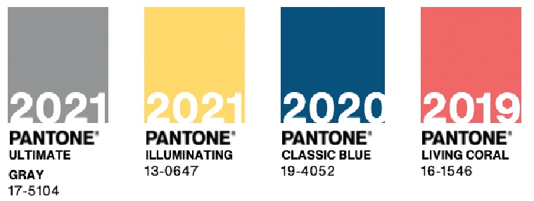
2021: Ultimate Gray & Illuminating
For 2021 Pantone decided to launch two colours, Ultimate Gray and Illuminating, which Pantone described as, “A marriage of colour conveying a message of strength and hopefulness that is both enduring and uplifting.”
After a very challenging 2020, the new Ultimate Gray and Illuminating were ‘message of happiness supported by fortitude’.
Leatrice Eiseman, Executive Director of The Pantone Colour Institute, said of the colours: “The union of an enduring Ultimate Gray with the vibrant yellow Illuminating expresses a message of positivity supported by fortitude. Practical and rock-solid but at the same time warming and optimistic, this is a colour combination that gives us resilience and hope.”
2020: Classic Blue
2019 saw a lot of turmoil, in terms of political, social, and economic uncertainty at home and internationally with the general election looming in the UK and a lack of clarity on Brexit. In the US the impeachment hearing dominated the headlines. It is perhaps not surprising then that The Colour Institute has selected Classic Blue its 2020 Colour of the Year.
The Colour Institute explained their choice: “Instilling calm, confidence, and connection, this enduring blue hue highlights our desire for a dependable and stable foundation on which to build as we cross the threshold into a new era.”
Executive Director Leatrice Eiseman said: “We are living in a time that requires trust and faith. Classic Blue, a solid and dependable blue hue we can always rely on. Imbued with a deep resonance, Classic Blue provides an anchoring foundation. Classic Blue encourages us to look beyond the obvious to expand our thinking; challenging us to think more deeply, increase our perspective and open the flow of conversation.”
2019: Living Coral
Described as a ‘animating and life-affirming coral hue with a golden undertone that energizes and enlivens with a softer edge’, Living Coral was the colour of 2019.
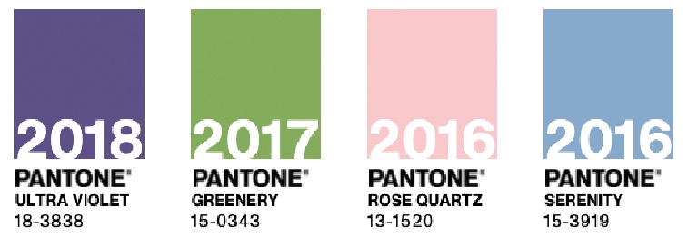
2018: Ultra Violet
Ultra Violet is definitely not Very Peri. Don’t make that faux pas. At the time of it’s unveiling is was described as ‘inventive’ and ‘imaginative’.
Executive Director Leatrice Eiseman said: “We are living in a time that requires inventiveness and imagination. It is this kind of creative inspiration that is indigenous to Ultra Violet, a blue-based purple that takes our awareness and potential to a higher level. From exploring new technologies and the greater galaxy to artistic expression and spiritual reflection, intuitive Ultra Violet lights the way to what is yet to come.”
Purple is also associated with spirituality and mindfulness, something that is much needed in a hectic and ever-moving world.
2017: Greenery
When Pantone announced its Colour of the Year for 2017 it was widely felt that this was a reference to the social and political environment and the need to regroup and refresh at that time.
Leatrice Eiseman said: “Greenery bursts forth in 2017 to provide us with the reassurance we yearn for amid a tumultuous social and political environment. Satisfying our growing desire to rejuvenate and revitalize, Greenery symbolizes the reconnection we seek with nature, one another, and a larger purpose.”
2016: Rose Quartz and Serenity
In 2016 Pantone blended two colours for the first time. Pantone said of the pairing: “As consumers seek mindfulness and well-being as an antidote to modern-day stresses, welcoming colours that psychologically fulfill our yearning for reassurance and security are becoming more prominent. Joined together, Rose Quartz and Serenity demonstrate an inherent balance between a warmer embracing rose tone and the cooler tranquil blue, reflecting connection and wellness as well as a soothing sense of order and peace.”


